
Client sketch to final
Diane Vargas
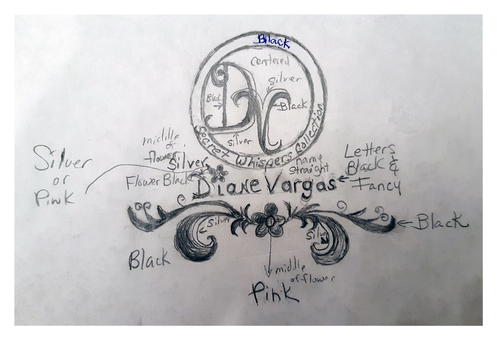
The client drew this one in pencil and labeled it: a centered DV, the collection name curved around the circle, a flourish underneath, and arrows pointing at each piece saying black, silver, or pink. The structure of the final mark is hers, line for line. What changed is the execution — the filigree became real scrollwork, the flourish resolved into a single flower sitting in the wordmark, and the "silver or pink" she was undecided about went to magenta, which holds its color at small sizes where silver turns to gray. It was delivered as a light lockup and a reversed one, because a personal brand ends up on dark packaging as often as white.